Design Document – Feedback

IMG_3975

We received the following feedback about the Design Document:

Concept description:

  • Don’t get too technical about it yet
  • Everyone, without technical knowledge, should understand this

Moscow method:

  • What are these used for?
  • Speakers for what kind of sounds?
  • How many displays?
  • Focus on functionality!

Concept sketches:

  • Don’t put old iterations in here.
  • We want to give a clear image of what’s being built in the first part of the document.

List of requirements:

Performance: 

  • Be more specific of the specs of the installation
  • In what kind of timeframe are people using this?

Life in service:

  • Keep in mind that kids can bash our installation too!

Target product cost:

  • Doesn’t say anything
  • We should DEFINE “Very low”

Transport:

  • Same as “target product cost”
  • HOW do we transport this and DEFINE “easy”

Size and weight:  

  • Put some things in here
  • It doesn’t have to be accurate YET

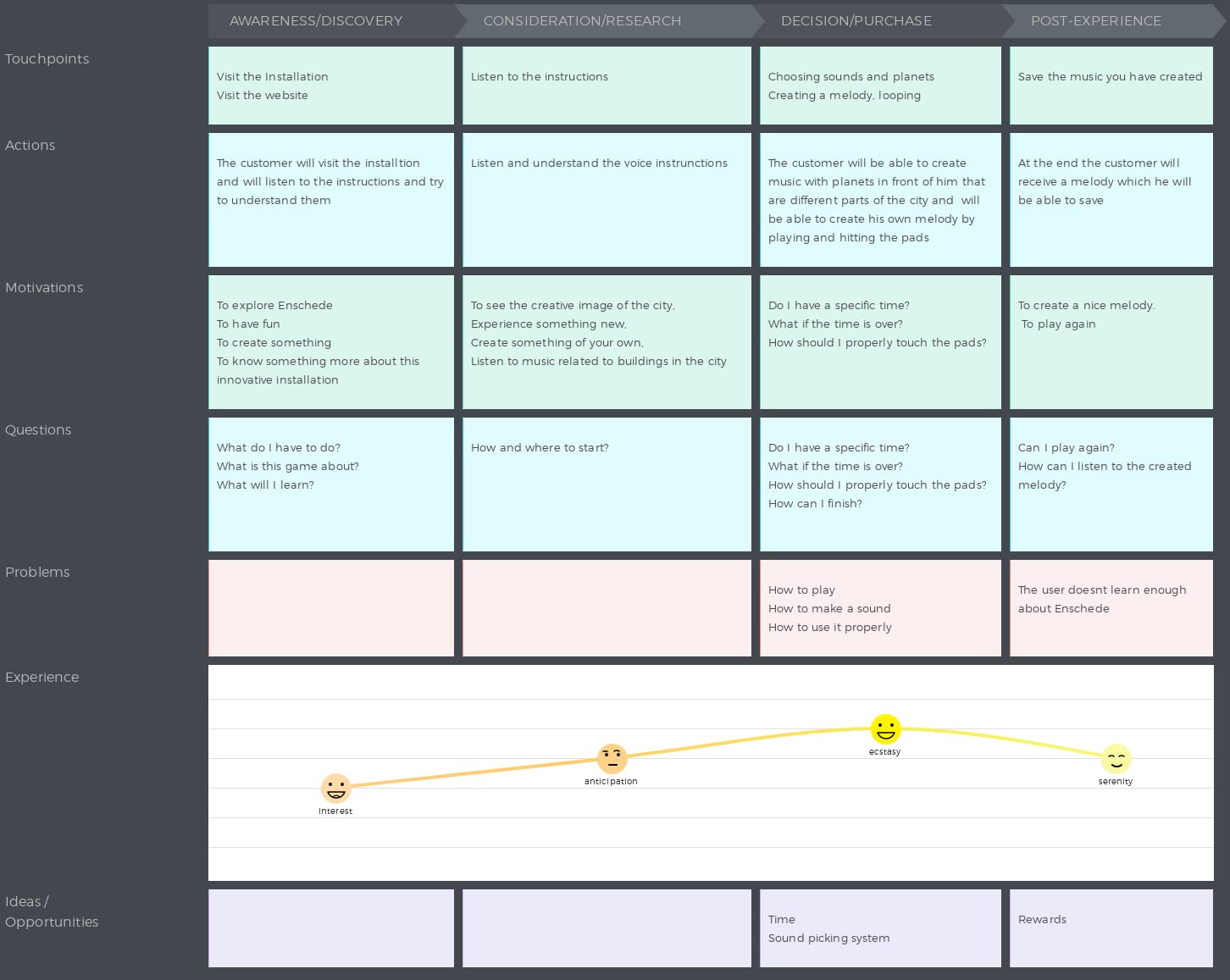
Customer Journey Map:

  • It looks complete
  • We need more possibilities to find the installation. (flyers, social media, etc.)
  • We need more entry points! (currently, it has 2)
  • Maybe make it more graphical!?
  • What is a success? The endpoint? Measurable success? HOW do we measure that? (coupons? forms?) Define “success”.

Morphological Chart:

  • Put images in here
  • Don’t limit yourself to the hardware
  • ONLY THINK ABOUT THE FUNCTIONALITY FIRST

State diagram:

1st diagram:

  • Think about how to turn it on
  • (distance sensors?)
  • The black dot represents the US turning the thing on. We shouldn’t be touching the thing after that

2nd diagram:

  • Attraction Mode
  • And play should be somewhere else
  • Loop button is not a state

Deployment Diagram:

  • Where is the computer?
  • This should tell us, where do we use and what

@appleflapjc @izabelatyprowicz @oyvindknustadgmailcom @uselessmarkies @ruhrexp


Product Owner Consultations – Feedback

61454704_186883358893579_777085808640262144_n

Today we had a meeting with the Product Owner – Boris Slaghuis.

This is the feedback that we’ve received:
  • Our target audience is too small if we promote music schools and music stores.
  • Focus more on concert halls.
  • Broaden the pool with Festival goers
  • There are a lot of themed festivals in Enschede, we can get a broader audience by promoting those.
  • Focus more on main events that attract more people
  • work more on attracting more people to the city
  • Check the document about the target group.
  • we should work on prototypes and testing our installation to know how it will work in reality
  • With all the different festival themes we can make it a universal installation.
  • we should work on promoting the city
  • the target group is the target group the people of Enschede/ city, not the store
  • we should test what people like
  • the idea is really cool but it doesn’t attract people and target group
  • why we are using the music?
  • the idea of the planets was already a good idea

@appleflapjc @burdetiadrian8 @izabelatyprowicz @oyvindknustadgmailcom @ruhrexp


Composing the Stylesheet

Now the final part of the stylesheet is putting it together.
It all fits nicely, the colors, the illustrations, logos and the fonts.
Ive added some elements that we can use along with the illustrations, photo’s, videos ect. From which some of them are based on Andrei his logo sketches.
Also Ive made a version of the logo that fits with a white background.

Schermafbeelding 2019-05-26 om 14.18.55.png

@appleflapjc

Stylesheet experimentation

For the stylesheet I looked up a lot of fonts and tried mixing and matching different color palletes.
I eventually came up with a mood/style that really fits the theme. We are going to use cool illustrations from Thom with this to give the whole stylesheet some more life.

This is a screenshot of my experiments for the stylesheet:

Schermafbeelding 2019-05-24 om 22.18.55.png

I used a greyish tone for the background to give it that music LP feel, and I used these six specific colors to make them really pop.

Next up Im going to create a stylesheet with the fonts info, guidelines and logo.

@appleflapjc

Customer Journey Map

I created the Customer Journey Map for our Installation.

Customer Journey Map

Customer Persona: The customer could be someone between 15-45 but more precisely it is somebody that it’s interested in making music, having fun, interested in games, exploring the city. It has to be somebody that uses technology, it’s competitive or likes to learn new things preferably a person that is visiting Enschede.

Value: Satisfaction, experience, explore the city, not get bored.

Our product need to meet the customer needs such as giving them an experience which it’s not boring, which will satisfy their needs, will be something pleasant and interesting to experience.

People will get a fun experience where they can also learn something.

It is fun because it’s always a new start and route. It’s exciting and not boring because of the multiple possibilities.

This is how our Customer Journey Map looks like:

cjm

@izabelatyprowicz

Style sheet 1

Today Jay-Cee and I made a plan for the style sheet. We gathered inspiration from various sources and made some basic sketches. After combining our inspiration and ideas for colours we created multiple palettes. Which one of these palettes we are going to use when and where still has to be decided.

Since we are both graphic designers and cannot work on the same thing at the same time. We decided to divide our work and roles for the style sheet. These roles may be continued throughout the project. Jay-Cee we will mostly bfunction as overall designer and do the layout and ‘feel’ of the style sheet and the designs. Thom will be mostly responsible for the illustrations and asset creation. These roles can ofcourse overlap sometimes, but this is our current setup and we think it will work well

WhatsApp Image 2019-05-23 at 15.15.04

@appleflapjc
@uselessmarkies